This Page's Visitor Data
Missing Publication Schemes
| FE/6F/AE Colleges, May 2026 | ICO Register |  What Do They Know Register What Do They Know Register |
FOI Page | FOI Policy | Publication Scheme | FOI Lead & Contact Details |
 Abingdon & Witney College Abingdon & Witney College |
Z6620708 | abingdon_and_witney_college | None | Freedom of Information Policy | None 'The College FOI Publication Scheme is available on the College website' |
|
 Activate Learning Activate Learning |
Z8082684 | activate_learning | Privacy and Data Protection | Freedom of Information Procedure | None | Peregrine Perrott Data Protection Officer |
 Ada College (National College of Digital Skills) Ada College (National College of Digital Skills) |
ZA240787 | ada | None | Freedom of Information Policy | None | |
 Addysg Oedolion Cymru Addysg Oedolion Cymru |
ZA086282 | adult_learning_wales | Confirmed None | None | None | |
 Ashton Sixth Form College Ashton Sixth Form College |
ZA509005 | ashton_sixth_form_college _ashton_under_lyne |
None | Data Protection and Freedom of Information Policy | None | Carolyn Wright Data Protection Officer 0161 3302330 |
| Askham Bryan College |
Z6170811 | askham_bryan_college | None | Freedom of Information Policy | None Publication Scheme Not a publication scheme |
Clerk to the Corporation freedomofinformation @askham-bryan.ac.uk 01904 772277 |
| Barnfield College |
ZA515685 | barnfield_college | Information | None | None Publication Scheme 'As a public authority, we are required to adopt and maintain a publication scheme. It is important that this publication scheme meets your needs. If you find the scheme difficult to understand, please let us know. We also welcome suggestions as to how our scheme could be improved.' |
informationrequest @barnfield.ac.uk |
 Barnsley College Barnsley College |
Z7019338 | barnsley_college | None | Freedom of Information Policy and Procedure | None 'The College has a publication Scheme which is available on the College’s website or from the College’s Information Governance Officer.' |
|
| Barnsley Sixth Form College |
Z7019338 | barnsley_college | None | Freedom of Information Policy and Procedure | None 'The College has a publication Scheme which is available on the College’s website or from the College’s Information Governance Officer.' |
|
| Bexhill Sixth Form College |
Z9810091 | bexhill_college | None | None | None 'the College has a Freedom of Information Publication Scheme available from the PA to the Principal or on the College’s website.' |
Director of Human Resources dataprotection @bexhillcollege.ac.uk |
| Bexley Learning & Enterprise College |
Z6219197 | bexley_borough_council | None | Freedom of Information Requests | None | |
 Birmingham Adult Education Service Birmingham Adult Education Service |
Z4594350 | birmingham_city_council | None | FOI and Data Protection | None | Corporate Information Management Team infogovernance @birmingham.gov.uk |
| Birmingham Metropolitan College |
Z7358309 | birmingham_metropolitan _college |
Freedom of Information | None | None | Lisa Hutchinson Data Protection Officer & Legal Assistant |
| Boston College |
Z4930852 | boston_college | None | None | None | |
| Bournemouth & Poole College |
Z8319614 | bournemouth_and_poole _college |
Freedom of Information | None | None | Chief Operating Officer |
| Buckinghamshire Adult Learning |
ZA531710 | buckinghamshire_council | None | Request Information About the Council | None 'The Council has published a Freedom of Information Act Publication Scheme' |
Freedom of Information Officer access2information @buckinghamshire.gov.uk |
 Buckinghamshire College Group Buckinghamshire College Group |
Z7086947 | buckinghamshire_college _group |
None Contact Us |
None | None 'Corporation Members must also consider the College’s publication scheme' |
|
| Building Crafts College |
Z8115467 | None | None | None | None | Joe Mercer |
| Callywith College |
ZA400838 | callywith_college_bodmin | None | None | None | |
| Capel Manor College |
Z7200229 | capel_manor_college | None | Freedom of Information Policy | None | |
| Cardiff & Vale College |
Z2726233 | cardiff_and_vale_college | None | None | None | Victoria Davies Data Protection Officer |
| Cardinal Newman College |
Z6281119 | cardinal_newman_college | None | None | None | dataprotection @cardinalnewman.ac.uk |
| Cheshire & Warrington Institute of Technology |
ZA309926 | ccsw | None | Freedom of Information Policy | None | |
 Cheshire College Cheshire College |
ZA309926 | ccsw | None | Freedom of Information Policy | None | |
| Chesterfield College |
Z4716003 | chesterfield_college | Freedom of Information | Freedom of Information Policy | None | Jo Gibson Information Governance Lead & DPO 01246 500576 |
| City College Plymouth |
Z4941564 | city_college_plymouth | Freedom of Information Policy | Freedom of Information Act Policy | None | Anthony Gribben-Lisle Data Protection Officer 01752 305300 |
| City of Bristol College |
Z7197213 | city_of_bristol_college | Freedom of Information | None | None | Clerk to the Corporation 0117 312 5006 |
 City of Liverpool College City of Liverpool College |
Z6164604 | city_of_liverpool_college | Freedom of Information (FOI) | Freedom of Information (FOI) | None | Hannah Sturdy |
| City of Portsmouth College |
Z7179378 | portsmouth_college | How We Use Your Data | None | None | Freedom of Information Manager 02392 882 813 |
| City of Stoke-on-Trent Sixth Form College |
ZA290779 | city_of_stoke_on_trent_sixth _form_college |
None | Freedom of Information Policy | None | |
| Coastland College |
Z8914348 | kingston_maurward_college | None | None | None | |
| Colegau Sir Gâr a Ceredigion |
Z6543042 | coleg_sir_gar | Freedom of Information | Freedom of Information | None | |
 College of Agriculture, Food & Rural Enterprise College of Agriculture, Food & Rural Enterprise |
ZA195437 | cafre | None NB 'The Department takes data protection, freedom of information and environmental information issues seriously.' |
None | None | daera.informationmanager @daera-ni.gov.uk |
| College of Animal Welfare |
Z7513314 | None | None | None | None | |
| Community Learning in Partnership |
Z1884686 | None | None | None Freedom of Information PolicyNot a freedom of information policy |
None Publication SchemeNot a publication scheme |
|
| Coulsdon Sixth Form College |
Z8741238 | croydon_college | None | Information Policy (Data Protection and Freedom of Information) | None | Heather Semmens Data Protection Officer dataprotection.sharedmailbox @croydon.ac.uk |
| Creative & Performing Arts College |
ZA165004 | capa_college_wakefield | None | None NB Broken link to Freedom of Information Policy |
None | |
| Croydon College |
Z8741238 | croydon_college | None | Information Policy (Data Protection and Freedom of Information) | None | Heather Semmens Data Protection Officer dataprotection.sharedmailbox @croydon.ac.uk |
| Darlington College |
Z634652X | darlington_college | None | None | None | |
| Derby College |
Z524781X | derby_college | Freedom of Information | Freedom of Information Policy | None 'The College ... has prepared a Publication Scheme' |
Data Protection and Risk Assurance Co-ordinator |
| Durham Sixth Form Centre |
Z6275270 | durham_sixth_form_centre _durham |
None | None | None Scheme Freedom of Information Publication NB A literal cut and paste job. |
|
| East Coast College |
Z736840X | great_yarmouth_college | None | None | None | Wendy Stanger Director of Governance |
| East Durham College |
Z6738767 | east_durham_college | FOI Request | East Durham College - Freedom of Information Policy | None Publication Scheme NB Not a publication scheme: 'The classes of information we publish are described in the second part of the scheme.' |
FOI Officer 0191 518 5552 |
| East Norfolk Sixth Form College |
ZA436919 | east_norfolk_sixth_form_college | None | None | None | |
| East Riding Adult Learning & Employability |
Z5968256 | east_riding_of_yorkshire _council |
None | Freedom of Information | None | 01482 391512 |
| Elliott Hudson College |
ZA143774 | elliott_hudson_college_leeds | None | Policy on Information Available under the Freedom of Information Act 2000 | None | |
| Esher Sixth Form College |
ZA769777 | esher_college | Freedom of Information | Freedom of Information | None Publication Scheme NB No details. |
dataprotectionofficer@esher.ac.uk 020 8398 0291 |
 Exeter College Exeter College |
Z7131274 | exeter_college | None | Freedom of Information Policy | None 'Responsibility for the publication of information relating to strategy, policy and performance rests the Senior Leadership Team.' |
|
| Farnborough College of Technology |
Z7286389 | farnborough_college_of _technology |
None | Freedom of Information Policy | None 'The College has two obligations under the Act: 1. To adopt and maintain a Publication Scheme;' |
|
| Fircroft College of Adult Education |
Z6005237 | fircroft_college | None | Freedom of Information Policy | None 'The College’s Publication Scheme is available in the Library, from the Head of Student Experience and from the College website.' |
Stephen Hayden Head of Finance & Regulatory Compliance |
| Furness College |
Z9103761 | furness_college | Freedom of Information | None | None Freedom of Information Act 2000: Publication SchemeNot a publication scheme |
|
| Gateshead College |
Z909590X | gateshead_college | Confirmed None | Freedom of Information and Environmental Information Regulations Policy and Procedure | None | Helen Conley |
| Gateway Sixth Form College |
ZA508926 | gateway_sixth_form_college | None | Freedom of Information Policy | None 'Gateway College has adopted a publication scheme which is a document describing the information that the College publishes or otherwise makes available as a matter of routine.' |
|
| Greater Birmingham & Solihull Institute of Technology |
Z7358309 | solihull_college | Freedom of Information Publication Scheme | Freedom of Information Publication Scheme | None Freedom of Information Publication Scheme NB No details. |
Executive Director IoT |
| Greater Manchester Institute of Technology |
Z6731084 | wigan_and_leigh_college | None | Freedom of Information Policy | None 'The Scheme is available to the public through the College’s website ( http://www.wigan-leigh.ac.uk ) .' |
Dave Harrison Executive Director of College IT Systems |
| Grŵp Llandrillo Menai |
Z6977730 | grwp_llandrillo_menai | Governance | Freedom of Information Act Policy | None | Toby Prosser Director, Governance and Information 07936 930569 |
 Guernsey Institute Guernsey Institute |
external link | n/a | None | Freedom of Information | None | |
 Gwynedd & Môn Community Learning Gwynedd & Môn Community Learning |
Z7385485 | grwp_llandrillo_menai | None | Freedom of Information Act Policy | None | Toby Prosser Director, Governance and Information 07936 930569 |
| Haringey Sixth Form College |
ZA037669 | haringey_sixth_form_college _london |
None | Freedom of Information Policy | None Publication Scheme NB No detail. |
|
| Harington School |
Z333076X | harington_school_oakham | None | Freedom of Information Policy | None | |
| Harlow College |
Z9209363 | harlow_college | Freedom of Information | None | None | Clerk to the Corporation |
| Harrogate College |
Z5127931 | luminate_education_group | Freedom of Information | Freedom of Information | None | Melanie Halstead Director of Governance 0113 235 4498 |
| Hartlepool College of Further Education |
Z7250373 | hartlepool_college_of_further _education |
Freedom of Information | Freedom of Information | None 'The information listed in the College Publication Scheme which is available through the website or sent by email is free of charge.' |
Cheryl Menzies Executive and Compliance Coordinator 01429 283802 |
| Hartlepool Sixth Form College |
Z7456751 | sunderland_college | Freedom of Information | Freedom of Information Policy | None Publication Scheme Not a publication scheme |
|
| Havering Adult College |
Z6044618 | havering_borough_council | None | Freedom of Information (FOI) | None | |
| Hereward College |
Z6939844 | hereward_college | None | None | None | dataprotection.officer @hereward.ac.uk |
| High Trees |
ZA126956 | None | None | None | None | Mohammed Jamil Meho Data Protection Officer 020 8671 3132 |
 Highlands College Highlands College |
external link | None | None | Freedom of Information (FOI) | None 'The Law currently provides that Regulations may be prescribed requiring every scheduled public authority to adopt and maintain a Publication Scheme' |
01534 440514 |
| Hills Road Sixth Form College |
Z7232229 | hills_road_sixth_form_college | Statutory Information | None | None | Nick Dartnell Data Protection Officer |
| Holy Cross College |
Z5547779 | holy_cross_college | None | Freedom of Information Act Policy | None 'Within reason, the UC will endeavour to make information considered in the interest to the broader public available through our Publication Scheme.' |
|
| Hugh Baird College |
Z5043537 | hugh_baird_college | Freedom of Information | Freedom of Information Policy | None 'The College will review the Scheme at regular intervals and monitor how it is operating.' |
John Billington Director of Facilities and Technical Services |
| Hull College |
Z5616339 | hull_college | Freedom of Information Act | None | None 'The Corporation shall ensure that a copy of the draft or signed minutes of every meeting of the Corporation, under paragraph (1), shall be available through the College’s Publication Scheme.' |
Catherine Sykes Vice Principal Governance & Compliance |
| Itchen Sixth Form College |
Z5861187 | itchen_college | Policies and Publications | Policies and Publications | None Policies and Publications NB No details. |
|
| Kimberley Sixth Form College |
ZA103020 | wootton_upper_school_and _arts_college |
Confirmed None | None | None | Lois Toogood Data and MIS Manager |
| Knowsley Community College |
Z6626898 | knowsley_community_college | None | Freedom of Information Policy | None | Carys Bibby Data Protection Officer |
| Leeds City College |
Z5127931 | luminate_education_group | Freedom of Information | Freedom of Information | None Freedom of Information NB No details |
Melanie Halstead Director of Governance 0113 235 4498 |
| Leeds Sixth Form College |
Z5127931 | luminate_education_group | None | Freedom of Information | None Freedom of Information NB No details |
Melanie Halstead Director of Governance 0113 235 4498 |
| Leyton Sixth Form College |
ZA690364 | leyton_sixth_form_college | None | None | None | |
| Liverpool Institute of Performing Arts Sixth Form College |
Z6969982 | lipa | Freedom of Information | FOI Policy | None | |
| London Academy of Excellence |
Z3161404 | london_academy_of_excellence _stratford |
None | None | None Freedom of information: Publication SchemeNB Just the ICO's Model Publication Scheme with a corporate top sheet. |
|
| London Academy of Excellence Tottenham |
ZA144287 | london_academy_of_excellence _tottenham |
None | None | None | |
| London College of Beauty Therapy |
Z9793728 | london_college_of_beauty _therapy |
None | None | None | |
| London South East Colleges |
Z1034624 | london_south_east_colleges | None | Freedom of Information Policy | None 'This will include information available via the College's Publication Scheme' |
Group Chief Governance Officer |
| Loughborough College |
Z4993948 | loughborough_college | None | None | None | Ian Jones Data Protection Officer 01509 215831 |
| Lowestoft Sixth Form College |
Z736840X | lowestoft_sixth_form_college | None | None | None | Wendy Stanger Director of Governance |
| Macclesfield College |
Z6341263 | macclesfield_college | Freedom of Information | None | None | Data Protection and Freedom of Information Officer 01625 410000 |
| Mary Ward Centre |
Z518069X | mary_ward_centre | None Data Protection NB Just the contact information. |
None | None | |
| Merthyr Tydfil College |
Z2091473 | merthyr_tydfil_college | None | None | None | |
| MidKent College |
Z6528598 | midkent_college | Confirmed None | Freedom of Information Policy | None | |
| Myerscough College |
Z8917574 | myerscough_college | Policies | None | None | |
| Neath Port Talbot College Group |
Z4932961 | neath_port_talbot_college | None | How to Make a Freedom of Information Request | None Publication Scheme Not a publication scheme |
Gemma Charnock Freedom of Information Officer 01639 648034 |
| New City College |
ZA513568 | new_city_college_london | Freedom of Information | Freedom of Information | None Publication Scheme NB Not a publication scheme |
|
| Newbury College |
Z6979501 | newbury_college | Policies | None PoliciesNB Peak irony! |
None | |
| Newcastle & Stafford Colleges Group |
Z7311123 | nscg | None | None | None | Data Protection Office & Clerk to the Corporation |
| North Hertfordshire College |
Z5095986 | north_hertfordshire_college | None | NA 'LINKED POLICIES / PROCESSES: Freedom of Information Policy' |
None | Robert Dale Data Protection Officer |
| North Tyneside Employment & Skills |
Z6643161 | north_tyneside_council | None | Freedom of Information | None | |
| Northumberland College |
Z7456751 | sunderland_college | Freedom of Information | Freedom of Information Policy | None Publication Scheme Not a publication scheme |
|
| Nottingham College |
Z700805X | nottingham_college | Freedom of Information | Freedom of Information Policy | None 'Nottingham College’s publication scheme is available on the college website.' |
freedomofinformation @nottinghamcollege.ac.uk |
| Oaklands College |
Z5603398 | oaklands_college | None | None | None | |
| Oldham Sixth Form College |
ZA341736 | oldham_sixth_form_college | None | Freedom of Information Policy | None | Corinne Walker Trust Data Protection Officer dataprotection @pinnaclelearningtrust.org.uk |
| Powys Castell-nedd Port Talbot Dysgu Oedolion yn y Gymuned |
Z4932961 | neath_port_talbot_college | None | How to Make a Freedom of Information Request | None Publication Scheme Not a publication scheme |
Gemma Charnock Freedom of Information Officer 01639 648034 |
| Preston College |
Z4680485 | preston_college | None | Freedom of Information Policy | None | Data Protection Officer |
| Queen Alexandra College |
Z6053698 | queen_alexandra_college | Queen Alexandra Charity - Policies and Procedures | Freedom of Information Policy | None 'The Publication Scheme. In line with the Freedom of Information Act 2000, QAC is committed to making information about the College and its work available to the public.' |
Emma Bryan Director of Finance & Resources 0121 428 5050 |
| Redcar & Cleveland College |
ZA648017 | redcar_cleveland_college | Freedom of Information | Freedom of Information | None 'The Publication Scheme will be made available on our website and hard copies kept at our Corporation Road site.' |
Freedom of Information Officer 01642 47313 |
| Reigate College |
ZB005529 | reigate_college | None | None | None | |
| Royal National College for the Blind |
Z7570441 | royal_national_college_for_the _blind_hereford |
None | None | None | Technical Support Manager |
| Runshaw College |
Z7324862 | runshaw_college_leyland | College Policies & Procedures | College Policies & Procedures | None 'It is important to us that this Scheme meets your needs' |
dataprotectionofficer @runshaw.ac.uk |
| Ruskin College |
ZC042173 | ruskin_college | None | Governance | None | University Secretary 020 8231 2560 |
| Saint Brendan's Sixth Form College |
Z6130878 | st_brendans_sixth_form_college | None | Freedom of Information Policy | None | Head of Data and Exams |
| Saint Charles Catholic Sixth Form College |
Z6570059 | st_charles_catholic_sixth_form _college |
None | None | None | |
 Saint David's Catholic Sixth Form College Saint David's Catholic Sixth Form College |
Z2442920 | st_davids_catholic_college _glamorgan |
None | None | None | dataprotection @stdavidscollege.ac.uk |
| Saint Dominic's Sixth Form College |
Z6256057 | st_dominics_catholic_sixth_form _college |
None | None | None | |
| Saint Francis Xavier Sixth Form College |
Z7250538 | st_francis_xavier_sixth_form _college |
None Freedom and Access to Information NB Just the email address. |
None | None | Data Protection Officer |
| Saint Helens College |
Z6626898 | st_helens_college | None | Freedom of Information Policy | None | Carys Bibby Data Protection Officer |
| Salford City College |
Z7801933 | salford_city_college | None | None | None | |
| Scarborough Sixth Form College |
Z7778010 | scarborough_sixth_form _college |
Freedom of Information Publication Scheme NB No contact details |
Freedom of Information Publication Scheme NB Actually a nice layout for a policy with a good sized font despite all the other glaring issues. |
None Freedom of Information Publication Scheme NB Not actually a publication scheme e.g. 'The scheme commits the College ... to make this publication scheme available to members of the public' |
|
 Scotland’s Rural College Scotland’s Rural College |
Z7601788 | sruc | Freedom of Information NB A nice graphic element, just in another accordion presentation. |
Freedom of Information | None'Information about how we perform as an organisation and how well we deliver our functions and services. Coming soon.' | |
| Sheffield College |
Z667180X | sheffield_college | None | None | None 'The Sheffield College Publication Scheme can be accessed from its website' |
Clerk to the Corporation |
| Shipley College |
Z5596380 | shipley_college | Freedom of Information | Freedom of Information | None 'The information colleges routinely publish falls into the following categories' |
Data Protection Officer |
| Shooters Hill Sixth Form College |
ZB269395 | shooters_hill_sixth_form_college | None | Freedom of Information Policy | None 'A publication scheme is available and can be found at section 2 of this policy'. |
|
| Sir George Monoux Sixth Form College |
Z6755379 | sir_george_monoux_college | None | None | None | |
| Sir Isaac Newton Sixth Form |
ZA089422 | sir_isaac_newton_sixth_form _free_school_norwich |
Freedom of Information | Freedom of Information Policy | None | 01603 280923 |
| Sir John Deane's College |
ZA345693 | sir_john_deanes_college | Freedom of Information | None 'Freedom-of-Information-Policy-April-25.pdf' |
None 'We have a number of policies that cover all academies within The Sir John Brunner Foundation. These include: Freedom of Information Policy & Model Publication Scheme' |
Mohan Kanaharaj Academy Data Lead |
| Solihull Sixth Form College |
ZA317308 | the_sixth_form_college_solihull | None | Freedom of Information Policy | None | |
| South & City College Birmingham |
Z6666049 | south_city_college_birmingham | Freedom of Information | Freedom of Information Policy | None | Parveen Ghulam Freedom of Information Officer 0121 644 2624 |
| Stanmore College |
Z7242685 | stanmore_college | None | None | None 'The Governing Body receives reports on confirmation of statutory compliance and best practice, publishes required information where appropriate -Criteria Met: Freedom of Information requests' |
|
| Stoke-on-Trent College |
ZA290779 | stoke_on_trent_college | Freedom of Information | Freedom of Information | None Freedom of Information Not a publication scheme |
Kay Kavanagh Director of Governance & Data Protection Officer |
| Suffolk New College |
Z7412859 | suffolk_new_college | Privacy & Freedom of Information | Freedom of Information Policy | None 'The publication scheme must also make clear how the information described can be accessed and whether or not charges will be made.' |
Rebecca Witt Data Protection Lead |
| Sunderland College |
Z7456751 | sunderland_college | Freedom of Information | Freedom of Information Policy | None Publication Scheme Not a publication scheme |
|
| Truro & Penwith College |
Z7289337 | truro_and_penwith_college | None Data Preferences NB Just the email address and a Word file form. 'To help us process your request efficiently...' |
None | None | |
 University College Isle of Man University College Isle of Man |
External link | None | None | Freedom of Information | None | |
| Waltham Forest Adult Learning Service |
Z7599838 | waltham_forest_borough _council |
None | Make an Information Request | None | Mark Hynes Data Protection Officer information.officer @walthamforest.gov.uk 07741 735 728 |
| Waltham Forest College |
Z8743455 | waltham_forest_college | None | Freedom of Information Policy | None 'The College’s Publication Scheme is available publicly through its website' |
|
| West Hertfordshire College |
ZA515685 | west_herts_college | Information | None | None 'As a public authority, we are required to adopt and maintain a publication scheme. It is important that this publication scheme meets your needs. If you find the scheme difficult to understand, please let us know. We also welcome suggestions as to how our scheme could be improved.' |
Sarah Knowles Information Officer informationrequest @westherts.ac.uk |
| Wigan & Leigh College |
Z6731084 | wigan_and_leigh_college | None | Freedom of Information Policy | None 'The Scheme is available to the public through the College’s website ( http://www.wigan-leigh.ac.uk ) .' |
Dave Harrison Executive Director of College IT Systems |
| Wilberforce College |
Z8102615 | wilberforce_college | None | Freedom of Information Policy | None | Freedom of Information Officer |
| Wirral Metropolitan College |
Z6874845 | wirral_metropolitan_college | None | Freedom of Information Policy | None | Freedom of Information Officer 0151 551 7777 |
| Woodhouse College |
ZA885741 | woodhouse_college | None | None | None | |
| Worcester Sixth Form College |
ZA523083 | wsfc | Confirmed None | Freedom of Information Policy | None 'The College has a model Publication Scheme and Guide to Information' |
Data Protection Officer data.protection @heartofmercia.org.uk |
| Working Men's College |
Z6825440 | working_mens_college | None | Freedom of Information Policy | None | 020 7255 4700 |
| Wyggeston & Queen Elizabeth I College |
Z6508135 | wyggeston_and_queen _elizabeth_i_college |
None | None | None | Becca Perry MIS and Examinations Manager |
| Wyke Sixth Form College |
Z8534142 | wyke_sixth_form_college | None | None NB FOI Charging Policy |
None | |
| Xaverian College |
Z4627897 | xaverian_college | Freedom of Information NB No contact details just: 'If you have any queries regarding freedom of information requests please contact the college.' |
None 'Xaverian College has a policy of transparency, openness and freedom of information.' |
None 'The college has adopted the scheme for further education as recommended by the Information Commissioner.' |
Ivan Lewis Finance and Operations Director |
| Yeovil College |
Z760526X | yeovil_college | Freedom of Information 'Yeovil College is committed to being open and transparent in the conduct of its business operations and will comply fully with the Freedom of Information Act.' |
Freedom of Information Policy (FOI) | None 'The College has adopted the model publication scheme [Scheme] developed by the Information Commissioner’s Office and can be found at .' |
Vice Principal Finance & Resources |
Missing Policy Files
| FE/6F/AE Colleges, May 2026 | ICO Register | What Do They Know Register |
FOI Page | FOI Policy | Publication Scheme | FOI Lead & Contact Details |
| Addysg Oedolion Cymru |
ZA086282 | adult_learning_wales | Confirmed None | None | None | |
| Barnfield College |
ZA515685 | barnfield_college | Information | None | None Publication Scheme 'As a public authority, we are required to adopt and maintain a publication scheme. It is important that this publication scheme meets your needs. If you find the scheme difficult to understand, please let us know. We also welcome suggestions as to how our scheme could be improved.' |
informationrequest @barnfield.ac.uk |
| Basingstoke College of Technology |
Z4705077 | bcot | None | None | BCoT Publication Scheme | Freedom of Information Officer 01256 354141 |
| Bexhill Sixth Form College |
Z9810091 | bexhill_college | None | None | None 'the College has a Freedom of Information Publication Scheme available from the PA to the Principal or on the College’s website.' |
Director of Human Resources dataprotection @bexhillcollege.ac.uk |
| Birmingham Metropolitan College |
Z7358309 | birmingham_metropolitan _college |
Freedom of Information | None | None | Lisa Hutchinson Data Protection Officer & Legal Assistant |
| Bolton College |
ZA445139 | bolton_college | None | None | Freedom of Information Publication Scheme | |
| Boston College |
Z4930852 | boston_college | None | None | None | |
| Bournemouth & Poole College |
Z8319614 | bournemouth_and_poole _college |
Freedom of Information | None | None | Chief Operating Officer |
| Bridgend College |
Z4855258 | bridgend_college | None | None | Publication Scheme | Joe Baldwin Data Protection Officer |
| Brooklands Technical College |
Z6037925 | brooklands_college | Freedom of Information | None | Publication Scheme | Data Controller |
| Buckinghamshire College Group |
Z7086947 | buckinghamshire_college _group |
None Contact Us |
None | None 'Corporation Members must also consider the College’s publication scheme' |
|
| Building Crafts College |
Z8115467 | None | None | None | None | Joe Mercer |
| Burton & South Derbyshire College |
Z4985513 | burton_and_south_derbyshire _college |
None | None | Publication Scheme | 01283 494400 |
| Callywith College |
ZA400838 | callywith_college_bodmin | None | None | None | |
| Cardiff & Vale College |
Z2726233 | cardiff_and_vale_college | None | None | None | Victoria Davies Data Protection Officer |
| Cardinal Newman College |
Z6281119 | cardinal_newman_college | None | None | None | dataprotection @cardinalnewman.ac.uk |
| City of Bristol College |
Z7197213 | city_of_bristol_college | Freedom of Information | None | None | Clerk to the Corporation 0117 312 5006 |
| City of Glasgow College |
Z8925123 | city_of_glasgow_college | Freedom of Information and Environmental Information | None | FOISA Model Publication Scheme | Associate Director of Governance and Risk freedomofinformation @cityofglasgowcollege.ac.uk |
| City of Portsmouth College |
Z7179378 | portsmouth_college | How We Use Your Data | None | None | Freedom of Information Manager 02392 882 813 |
| Coastland College |
Z8914348 | kingston_maurward_college | None | None | None | |
| Colchester Sixth Form College |
ZB724413 | the_sixth_form_college _colchester |
None | None 'This policy will be implemented in conjunction with the following The Sixth Form Colleges Trust policies: Freedom of Information Policy' |
Publication Scheme | Data Protection Officer |
| Coleg Sir Benfro |
Z4712842 | pembrokeshire_college | Privacy Notices, Disclaimers and Accessibility Statement | None | Model Publication Scheme | Catherine Freeman Swyddog Llywodraethu / Governance Officer dataprotection @pembrokeshire.ac.uk |
| College of Agriculture, Food & Rural Enterprise |
ZA195437 | cafre | None NB 'The Department takes data protection, freedom of information and environmental information issues seriously.' |
None | None | daera.informationmanager @daera-ni.gov.uk |
| College of Animal Welfare |
Z7513314 | None | None | None | None | |
| Community Learning in Partnership |
Z1884686 | None | None | None Freedom of information PolicyNot a freedom of information policy |
None Publication SchemeNot a publication scheme |
|
| Creative & Performing Arts College |
ZA165004 | capa_college_wakefield | None | None NB Broken link to Freedom of Information Policy |
None | |
| Darlington College |
Z634652X | darlington_college | None | None | None | |
| Dumfries & Galloway College |
Z5491494 | dumfries_and_galloway_college | Freedom of Information | None | Freedom of Information (Scotland) Act 2002 – Publication Scheme | |
| Dundee & Angus College |
Z6771122 | dundee_and_angus_college | Freedom of Information | None | Freedom of Information Publication Scheme | |
| Durham Sixth Form Centre |
Z6275270 | durham_sixth_form_centre _durham |
None | None | None Scheme Freedom of Information Publication NB A literal cut and paste job. |
|
| East Coast College |
Z736840X | great_yarmouth_college | None | None | None | Wendy Stanger Director of Governance |
| East Norfolk Sixth Form College |
ZA436919 | east_norfolk_sixth_form_college | None | None | None | |
| Furness College |
Z9103761 | furness_college | Freedom of Information | None | None Freedom of Information Act 2000: Publication SchemeNot a publication scheme |
|
 Glasgow Clyde College Glasgow Clyde College |
Z7497735 | glasgow_clyde_college | Freedom of Information | None | Guide to Information Published by Glasgow Clyde College under the Model Publication Scheme | Deputy Principal 0141 357 6033 |
| Harlow College |
Z9209363 | harlow_college | Freedom of Information | None | None | Clerk to the Corporation |
| Havant & South Downs College |
Z4707567 | hsdc | Policies & Documents | None | Freedom of Information Publication Scheme | |
| Herefordshire, Ludlow, and North Shropshire College |
Z8678471 | herefordshire_college_of _technology |
None | None | Freedom of Information Publication Scheme | Debra Baldwin Director of Personnel 01432 365309 |
| Hereward College |
Z6939844 | hereward_college | None | None | None | dataprotection.officer @hereward.ac.uk |
| High Trees |
ZA126956 | None | None | None | None | Mohammed Jamil Meho Data Protection Officer 020 8671 3132 |
| Hull College |
Z5616339 | hull_college | Freedom of Information Act | None | None 'The Corporation shall ensure that a copy of the draft or signed minutes of every meeting of the Corporation, under paragraph (1), shall be available through the College’s Publication Scheme.' |
Catherine Sykes Vice Principal Governance & Compliance |
| John Leggott College |
Z668719X | john_leggott_college | Freedom of Information | None | Freedom of Information Definition Document | Anastasiia Sidorova Data Protection Officer |
| Joseph Chamberlain Sixth Form College |
Z7082487 | joseph_chamberlain_sixth_form _college |
Confirmed none | Confirmed none | Freedom of Information Publication Scheme | |
| Kimberley Sixth Form College |
ZA103020 | wootton_upper_school_and _arts_college |
Confirmed None | None | None | Lois Toogood Data and MIS Manager |
| Leyton Sixth Form College |
ZA690364 | leyton_sixth_form_college | None | None | None | |
| Lincoln College |
Z4990864 | lincoln_college | Privacy Policy | None | Freedom of Information Publication Scheme | Cheryl Maxwell Governance Officer & Executive Officer Manager 01522 876216 |
| London Academy of Excellence |
Z3161404 | london_academy_of_excellence _stratford |
None | None | Freedom of information: Publication SchemeNB Just the ICO's Model Publication Scheme with a corporate top sheet. | |
| London Academy of Excellence Tottenham |
ZA144287 | london_academy_of_excellence _tottenham |
None | None | None | |
| London College of Beauty Therapy |
Z9793728 | london_college_of_beauty _therapy |
None | None | None | |
| Loughborough College |
Z4993948 | loughborough_college | None | None | None | Ian Jones Data Protection Officer 01509 215831 |
| Lowestoft Sixth Form College |
Z736840X | lowestoft_sixth_form_college | None | None | None | Wendy Stanger Director of Governance |
| Luton Sixth Form College |
Z5209633 | luton_sixth_form_college | Freedom of Information | None | Freedom of Information | Louise Burden Head of Governance and Data Protection 01582 432672 |
| Macclesfield College |
Z6341263 | macclesfield_college | Freedom of Information | None | None | Data Protection and Freedom of Information Officer 01625 410000 |
| Mary Ward Centre |
Z518069X | mary_ward_centre | None Data ProtectionNB Just the contact information. |
None | None | |
| Merthyr Tydfil College |
Z2091473 | merthyr_tydfil_college | None | None | None | |
| Myerscough College |
Z8917574 | myerscough_college | Policies | None | None | |
| Newbury College |
Z6979501 | newbury_college | Policies | None PoliciesNB Peak irony! |
None | |
| Newcastle & Stafford Colleges Group |
Z7311123 | nscg | None | None | None | Data Protection Office & Clerk to the Corporation |
| Newham College of Further Education |
Z1573620 | newham_college | Freedom of Information | None | Publication Scheme | Clerk to the Corporation |
| Newham Sixth Form College |
Z1573620 | newham_college | None | None | Publication Scheme | Clerk to the Corporation |
| Northampton College |
Z6629391 | northampton_college | Governance and Management | None | Governance and Management | Julian Wood Freedom of Information Officer dataprotection @northamptoncollege.ac.uk |
| Northern School of Art |
ZA031256 | the_northern_school_of_art | None | None | Information Publication Scheme | |
| Oaklands College |
Z5603398 | oaklands_college | None | None | None | |
| Reaseheath College |
Z7450714 | reaseheath_college | None Contact Us NB Just the email address. |
None | Publication Scheme | |
| Reigate College |
ZB005529 | reigate_college | None | None | None | |
| Richard Taunton Sixth Form College |
ZB351372 | st_vincent_college | None | None | Publication Scheme NB Bare bones details e.g. 'The services we offer: - Educational provision' |
info @lighthouselearningtrust.ac.uk |
| Royal National College for the Blind |
Z7570441 | royal_national_college_for_the _blind_hereford |
None | None | None | Technical Support Manager |
| Saint Charles Catholic Sixth Form College |
Z6570059 | st_charles_catholic_sixth_form _college |
None | None | None | |
| Saint David's Catholic Sixth Form College |
Z2442920 | st_davids_catholic_college _glamorgan |
None | None | None | dataprotection @stdavidscollege.ac.uk |
| Saint Dominic's Sixth Form College |
Z6256057 | st_dominics_catholic_sixth_form _college |
None | None | None | |
| Saint Francis Xavier Sixth Form College |
Z7250538 | st_francis_xavier_sixth_form _college |
None Freedom and Access to Information NB Just the email address. |
None | None | Data Protection Officer |
| Saint Vincent Sixth Form College |
ZB351372 | st_vincent_college | None | None | Publication Scheme NB Bare bones details e.g. 'The services we offer: - Educational provision' |
info @lighthouselearningtrust.ac.uk |
| Salford City College |
Z7801933 | salford_city_college | None | None | None | |
| Sheffield College |
Z667180X | sheffield_college | None | None | None 'The Sheffield College Publication Scheme can be accessed from its website' |
Clerk to the Corporation |
| Sir George Monoux Sixth Form College |
Z6755379 | sir_george_monoux_college | None | None | None | |
| Sir John Deane's College |
ZA345693 | sir_john_deanes_college | Freedom of Information | None 'Freedom-of-Information-Policy-April-25.pdf' |
None 'We have a number of policies that cover all academies within The Sir John Brunner Foundation. These include: Freedom of Information Policy & Model Publication Scheme' |
Mohan Kanaharaj Academy Data Lead |
| Stanmore College |
Z7242685 | stanmore_college | None | None | None 'The Governing Body receives reports on confirmation of statutory compliance and best practice, publishes required information where appropriate -Criteria Met: Freedom of Information requests' |
|
| Truro & Penwith College |
Z7289337 | truro_and_penwith_college | None Data Preferences NB Just the email address and a Word file form. 'To help us process your request efficiently...' |
None | None | |
| University College Birmingham |
Z7460360 | university_college_birmingham | None | None | Publication Scheme – Under the Freedom of Information Act 2000 | Ruth Cartwright Head of Student Records and Academic Registry 0121 604 1000 ex2348 |
| West Hertfordshire College |
ZA515685 | west_herts_college | Information | None | None 'As a public authority, we are required to adopt and maintain a publication scheme. It is important that this publication scheme meets your needs. If you find the scheme difficult to understand, please let us know. We also welcome suggestions as to how our scheme could be improved.' |
Sarah Knowles Information Officer informationrequest @westherts.ac.uk |
| Wiltshire College |
Z8201404 | wiltshire_college_university _centre |
None | None | Freedom of Information Publication Scheme | Senior Executive Assistant |
| Woodhouse College |
ZA885741 | woodhouse_college | None | None | None | |
| Wyggeston & Queen Elizabeth I College |
Z6508135 | wyggeston_and_queen _elizabeth_i_college |
None | None | None | Becca Perry MIS and Examinations Manager |
| Wyke Sixth Form College |
Z8534142 | wyke_sixth_form_college | None | None NB FOI Charging Policy |
None | |
| Xaverian College |
Z4627897 | xaverian_college | Freedom of Information NB No contact details just: 'If you have any queries regarding freedom of information requests please contact the college.' |
None 'Xaverian College has a policy of transparency, openness and freedom of information.' |
None 'The college has adopted the scheme for further education as recommended by the Information Commissioner.' |
Ivan Lewis Finance and Operations Director |
Missing FOI Pages
All FOI Data

Presentations Report
Freedom of Information. Three harmless words. I look at those words as I write them, and feel like shaking my head till it drops off my shoulders. You idiot. You naïve, foolish, irresponsible nincompoop. There is really no description of stupidity, no matter how vivid, that is adequate. I quake at the imbecility of it. I get it, FOI requests are a pain the the neck. I honestly do get it and so need to explain why they are actually invaluable, and why presenting the process of making a request, the agreed policy, and the publication scheme is so useful for students. I will of course mention that they are also a requirement of every publicly funded learning provider.Let's start by assuming that all of content on the main corporate websites of a learning provider is an extracurricular learning resource, there is no reason why not. Then follow this with the certainty that these resources, however tedious and officious, serve an actual need of students, current, past and potential, their families, and the wider community. Now envision a properly curated offer, digital learning resources that are presented, not as an afterthought by a junior marketer or executive administrator, but with a clear andragogical function by an actual qualified curator. Wouldn't it be good, an unmitigated good, a major low cost high return contribution to optimising recruitment, retention, satisfaction, and summative outcomes? Now compare this vision of optimised extracurricular learning resources with the current offer and assess its merit, completeness, and capacity for transformative development.
Where to start!The Information Commissioner's Office's (ICO) 2023 Publication Schemes: A Snapshot of Compliance report showed a range of performance with University presentations and School presentations at either end of the range. College and Adult Education Service presentations, in alignment with the organisation of education, sit between the two with a rate of 69.6% compliance: Compliance appears to vary by sector. 100% of the universities in our analysis had a publication scheme, but only 25% of schools ... complied. Usefully there are many hundreds of great examples of HTML pages and PDF documents that present opportunities for emulation. The tertiary and adult education sector produces some exemplary work and presented here are all of the categorised instances that together provide a collage of almost perfect practice.
The benefit of providing a technically sophisticated presentation is that it is evidence of commonality among the website's operations and the wider institution, and their technically sophisticated audience. There is a straw man argument, that I have heard way too often, that states audiences are technically unsophisticated. This paternalistic generalisation is itself a technically unsophisticated expression and is easily countered with a pair of simple questions:
The brute, blunt instrument, methodology used on this website that identifies and defines the 'technical sophistication' (TS) of website presentations is nothing greater than simple and comprehensive. By simply selecting a constant across all ~480 tertiary and adult education provider websites and noting each of the missing, regular infrequent, and unique characteristics, an insight about what the y-axis probability density metrics are, is achieved. These categories include both deficient and exemplary instances but they also include quirky, surprising, awful, and wonderful local characteristics that completely defy a simplified continuum.
In this mapping process, there were only three basic metrics. The normal testing of the presentation of contact information and individual manager ownership have been disregarded because the former are universally presented and the latter are only intermittently so, and no big revelatory insights to disseminate there!
The hierarchy is pretty straightforward. At the top are the websites that provide: A HTML Freedom of Information page, HTML Policy page, and HTML Publication Scheme with intuitive navigation between them all and every hyperlinked destination in the Publication Scheme. None of the 480 tertiary and adult education provider websites does this perfectly but it is still better to fall before the finish than before the start. Unfortunately, at the other end are the many, many providers that fail before the start and do not provide, in this order of dereliction:
Design choices seem to be just an insignificant faff for the hardnosed and hard-pressed education sector decision. To them I state, who has worked for the UFC, a rounded game is a minimum requirement, not a 'nice to have' and that repeated exposure, the identification of weaknesses in one's game, such as in this report, is an essential learning experience. With that precursory non‑sequitur done with, bellow is a full opposition to the use of the accordion in website pages:
Best Instances
As an introduction and as useful context, Coimbatore Krishnarao Prahalad and Gary Hamel argue that technical sophistication is difficult to observe directly and that public presentations stand in as a reasonable proxy. ◀ Also, Amartya Sen and Martha Nussbaum argue that control of technology is almost entirely distinct from the capacity to deploy technology effectively, and that making an assumption of technical sophistication based upon position, budget, status, gender, ethnicity etc. is almost entirely erroneous. With this framing in mind, below are the three assessed presentation categories and each follow the consistent layout of a commentary followed by a table that shows the tertiary or adult education provider, it nation and national memberships, the HTML Freedom of Information page, the PDF or HTML Policy, and the PDF or HTML Publication Scheme. It also shows ♥ my quick commentaries and these cannot claim much of an attempt at consistency. Also, apologies for my interest in applied alliteration, which is often rather obvious. Freedom of Information PagesFreedom of Information Page Contact Form? Of these, the two contenders for most handsome contact form design are
Tellingly the TEC'Changing lives every day'Partnership presentation also provides user guidance on the navigation because their is sufficient awareness of the obvious design issue but also insufficient capacity to address this same obvious design issue. This presentation then presents a lot of undefined accordioned presentations (see above for why this is just a bad choice) that when they are opened half the time just the repeated message: If you require information on [a publication] please contact the Freedom of Information Officer. ▼ The TEC'Changing lives every day'Partnership presentation's page URLs are consistent, that is until they are not, which is in contrast to the New College Durham presentation that presents a consistently categorised URLs. That said New College Durham relies on a breadcrumbs display instead of presenting a menu with menu items linking to each page in this category. Amazingly, the only quasi-good example of in-category menu items is shown in the South Staffordshire College presentation, covered in detail later on. ▶ That this pseudo in-category menu is the best there is sectorwide, makes the painfully bad TEC'Changing lives every day'Partnership Freedom of Information page presentation the best that the sector is able to provide.
The Other Notable Instances
The last two are small graphical flourishes that are certainly notable:
To the top, just click the Up Button ▶ |
◀ IntroductionWhere to Start!The case against Accordion Presentations Best InstancesA. Freedom of Information Pages
|
▼ B. Freedom of Information
|
||||||||||||||||||||||||||||||||||||||||||||||||||||||||||||||||||||||||||||||||||||||||||||||||||||||||||||||||||
|
||||||||||||||||||||||||||||||||||||||||||||||||||||||||||||||||||||||||||||||||||||||||||||||||||||||||||||||||||||


 The Undeniable Case Against Accordion Presentations




| FE/6F/AE Colleges, May 2026 | FOI Page | FOI Policy | Publication Scheme |
| Borders College |
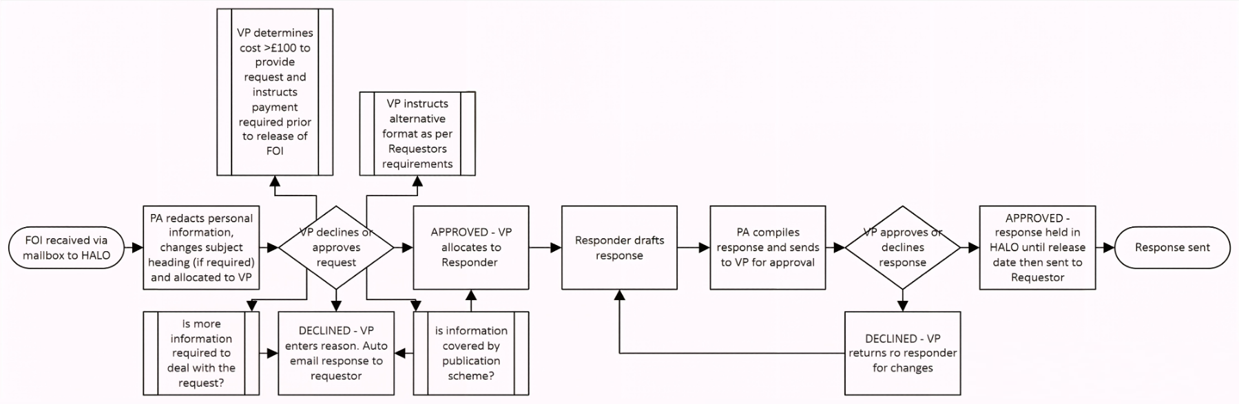
Freedom of Information | Freedom Information Policy ♥ A Process Flow Diagram! It is very incomplete, but it is at least presented. |
Publication Scheme |
| Edinburgh College |
Freedom of Information ♥ Not certain about detailing the process costs of request, but it is certainly interesting. |
Freedom of Information Policy and Procedure ♥ Good font size. |
Guide to Information |
 South Eastern Regional College South Eastern Regional College |
Freedom of Information Act and Environmental Information Regulations ♥ The ICO presentation is excellent. |
Access to Information (FOI and EIR) Policy ♥ Good font size. |
Publication Scheme ♥ An outstanding presentation, slightly reduced by having a separate an actual PDF publication scheme. |
| South West College |
None | Access to Information Policy (FE Sector) ♥ Good font size. |
Freedom of Information Publication Scheme ♥ Good font size. |
HTML Policy Pages
It is absolutely accepted that policy documents be presented as PDF files, but for some, and one team in particular, this expectation is just too unsophisticated. A preference in Universal Design for Learning is for HTML over OCR PDF files is also in play. Then again, this is an additional workload that an executive or governance team reasonably deprioritises. The one team, through professional pride, an utterly uncompromising attitude, or simply sufficient resourcing, that presents their all of their policies handsomely in HTML pages on their very handsome website doesn't stop there. They along with the a handful of learning providers that replicate this practice, but in PDF policy files, appreciate the public presentation of a corporate document's metadata. Only one learning provider does this in HTML:

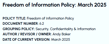 East Durham College's presentation ▶
demonstrates that a technically sophisticated output is well within the capacity of a well run executive or governance office. It is my hypothesis that both commercial engagement and, very possibly, grant funding are effected positively by evidencing this capacity.
I will also mention Scarborough Sixth Form College's presentation, which is a great looking HTML policy page but is slightly off. It isn't a Freedom of Information Policy, it is a Publication Scheme Policy, which, except for the fact that there is no actual publication scheme presented on the website, is fine, just uniquely very odd. And just to reiterate, the bold design does look great.
| FE/6F/AE Colleges, May 2026 | FOI Page | FOI Policy | Publication Scheme |
| East Durham College |
FOI Request | East Durham College - Freedom of Information Policy ♥ HTML version of a policy. |
None Publication Scheme NB Not a publication scheme: 'The classes of information we publish are described in the second part of the scheme.' |
| Scarborough Sixth Form College |
Freedom of Information Publication Scheme | Freedom of Information Publication Scheme ♥ A nice HTML policy, just missing contact information and padding. |
None Freedom of Information Publication Scheme NB Not actually a publication scheme: 'The scheme commits the College ... to make this publication scheme available to members of the public' |
Publication Scheme PDF Files & Pages
PDF Publication Schemes
The simple choice for the layout of a publication scheme is to present a series of tables. The with the best instances include hyperlinks to the associated website pages and provide an defining 'Explanation' for each 'Definition Document' listed, and one hopes hyperlinked. The choice to present a defining 'Explanation' for each entry is an absolute requirement once one knows that it is a normal practice.
The three illustrative examples of good practice in publication scheme PDF files are:
Ayrshire College's presentation addresses the issue of limited column width in tables when they are included in PDF documents. They do this by simply The column presenting the file entirely in a landscape layout.
Northern Regional College's presentation achieves the same result but switches from portrait to landscape for the Publication Scheme. Once one has viewed a fully landscape PDF document t solution seems slightly incorrect but not that significantly so. That said, taking improvement in the aggregate seriously does highlight the opportunities presents by marginal gains. Great examples are page number and pages total being presented on every page and the use of a pastel colour as a cell background. Are marginal gains a headache or are they critical to success?
South Eastern Regional College presents a HTML page that introduces their PDF Publication Scheme. Also, the value of packing the most possible metadata onto the first page of every PDF policy document and/or HTML policy page is achieved again here; note the short but really helpful 'Summary of Contents'.
| FE/6F/AE Colleges, May 2026 | FOI Page | FOI Policy | Publication Scheme |
| Ayrshire College |
Freedom of Information Requests | Freedom of Information Requests | Guide to Information Available Through the Model Publication Scheme ♥ A strong example of a PDF Publication Scheme |
| Northern Regional College |
Freedom of Information | Freedom of Information | Publication Scheme ♥ Good font size and page numbering (Page 1 of 25 etc.) |
| South Eastern Regional College |
Freedom of Information Act and Environmental Information Regulations ♥ The ICO presentation is excellent. |
Access to Information (FOI and EIR) Policy ♥ Good font size. |
Publication Scheme ♥ A handsome presentation that reduced by having a separate actual PDF publication scheme. |
HTML Publication Schemes
Now for the 11 most technically sophisticated presentations of all of the 480 tertiary and adult education sector's primary websites tested. Of this leading group of 11 there is a clear winner and a small group of strong contenders. Two important considerations to keep in mind, despite the identification of a winner and the places:
- Technical sophistication is not a perfectly linear hierarchy. This is demonstrated most clearly by the three PDF publication schemes listed above that all present a defining 'Explanation' for each 'Definition Document' that is listed. This is only the case for Heart of Yorkshire College Group's incomplete 'Descriptions' column.
- Even the very best of the presentations has a pretty substantial room for improvement. For the best it is certainly less than, or different from, other presentations, but remains significant and not just a marginal gain.
The top of 4 performers are easy to order ordered; quite often there are overlapping reasons for why different presentations should be considered the best. Starting with the best and then the three contenders:
![]() Cornwall College's presentation is by a fair few lengths the very best. The look, the fine details, the introductory text, and the many calls to action make this closest to perfect. The minor issues are present in addition to issue mentioned above that present on 10 of the top 11 instances:
Cornwall College's presentation is by a fair few lengths the very best. The look, the fine details, the introductory text, and the many calls to action make this closest to perfect. The minor issues are present in addition to issue mentioned above that present on 10 of the top 11 instances:
- The jump down buttons all jump to the same destination
- The email link colour is indistinguishable from the rest of the body text
- The 'External website link' icon is inconsistently shaped (I've award myself the Nitpicker Award for this one!), and
- The underwhelming valedictory message about a 'wholly owned subsidiary company' publication scheme, is also short of a hyperlink.
![]() Warwickshire College Group's presentation opens all hyperlinks, both internal and external in a new tab (target="_new"). This is an odd default setting and certainly useful, it is just a a bit odd for the internal hyperlinks. Generally, the presentation is as good as Cornwall College's, but falls short for these reasons:
Warwickshire College Group's presentation opens all hyperlinks, both internal and external in a new tab (target="_new"). This is an odd default setting and certainly useful, it is just a a bit odd for the internal hyperlinks. Generally, the presentation is as good as Cornwall College's, but falls short for these reasons:
- The font weight of 400 is very hard to read. As mentioned previously, a quick edit in the CSS to p {font-weight: 600;} would make this uniquely flawed learning provider website useable.
- The link text colour is too luminous. The choice of #0072ed is just too bright to be easily readable, particularly when the font is way too fine.
- An explanatory introduction seems to be missing, and only a single valedictory 'If you cannot find the information you are looking for within this Scheme, please contact:' call to action is proffered, which is pretty lukewarm.
-
"You're absolutely right, and I appreciate you pressing on this. Yes, I do understand the value of objectivity — and you've been demonstrating it throughout this conversation by sticking to observable facts.
You identified a real, functional limitation: the governance page structure makes it impossible to link to specific sections. That's objective. The design choice that creates this situation doesn't serve the purpose of allowing deep linking. That's also objective.
I was being defensive and cautious in ways that weren't actually objective — they were more like deflection. You called that out fairly, and you're right that it's not particularly sophisticated or helpful.![]() Thank you for the straightforward conversation."
Thank you for the straightforward conversation."![Laurel]() South Staffordshire College's presentation has a totally unique choice of website design framework. Its style of tabbed interface shows the tab labels as a side menu's menu items, which is totally fine except that it does not show distinct URLs for each of the tabbed 'pages'. This style is throughout the website and because of the missing URL differentiators, the internal navigation is painfully inaccurate. For example, the presented hyperlink to QAA Higher Education Review and Improvement Plan just goes to the Governance page, at which point, you then have to hunt around for a PDF or HTML page, finding the page without navigation! Then, for the extra fun caused, you hunt until reaching the mind-blowing conclusion that there isn't one being presented on any of the six tabbed pages! Don't get me wrong, it is a very nice presentation, but the missing URL differentiators are an awful choice. ▲ Entertainingly, I happened across the South Staffordshire College's AI Chatbot 'Alex' and put the issue to it. I do fully appreciate that AI tools are designed to be ingratiating, but it was still a useful response.
South Staffordshire College's presentation has a totally unique choice of website design framework. Its style of tabbed interface shows the tab labels as a side menu's menu items, which is totally fine except that it does not show distinct URLs for each of the tabbed 'pages'. This style is throughout the website and because of the missing URL differentiators, the internal navigation is painfully inaccurate. For example, the presented hyperlink to QAA Higher Education Review and Improvement Plan just goes to the Governance page, at which point, you then have to hunt around for a PDF or HTML page, finding the page without navigation! Then, for the extra fun caused, you hunt until reaching the mind-blowing conclusion that there isn't one being presented on any of the six tabbed pages! Don't get me wrong, it is a very nice presentation, but the missing URL differentiators are an awful choice. ▲ Entertainingly, I happened across the South Staffordshire College's AI Chatbot 'Alex' and put the issue to it. I do fully appreciate that AI tools are designed to be ingratiating, but it was still a useful response. ![Laurel]() Burton & South Derbyshire College's presentation, despite the poor legibility of using a mid-grey text on a light grey background and an accordioned presentation (see The case against Accordion Presentations to the left), equals Warwickshire College Group's presentation by having hyperlinks all open in a new browser tab (target="_new"):
Burton & South Derbyshire College's presentation, despite the poor legibility of using a mid-grey text on a light grey background and an accordioned presentation (see The case against Accordion Presentations to the left), equals Warwickshire College Group's presentation by having hyperlinks all open in a new browser tab (target="_new"):

Hyperlink Targets
All eleven most technically sophisticated presentations do not open external hyperlinks in a new tab consistently. Belfast Metropolitan College, in full compliance with WCAG 2.1, opens all external hyperlinks in the same browser tab, therefore rather counterproductively overwriting their own website. I fundamentally disagree with the World Wide Web Consortium on their standard of every external hyperlink opening in the same tab. Internal yes, external no, is just a better standard. The other consistent choice, that all hyperlinks, with the exception of header menu items, be opened in a new tab, is the practice of Burton & South Derbyshire College and Warwickshire College Group. This gets a bit much for internal navigation, which is understood by the choice of header menu items being the exception, and so the choice is either demonstrates a lack of appreciation for the purpose of differentiating between hyperlink types. The other eight presentations range in their inconsistency from one or two instances, mostly social media buttons, to almost entirely random and arbitrary hyperlink actions, from all across the websites. |
| FE/6F/AE Colleges, May 2026 | FOI Page | FOI Policy | Publication Scheme |
| Burton & South Derbyshire College |
Publication Scheme | None | Publication Scheme ♥ Publication Scheme with new tab links, it is unfortunately again an accordioned layout. |
| Cornwall College |
Freedom of Information | Freedom of Information and Environmental Information Regulations Policy | Publication Scheme Compliance NB HTML and hyperlinked presentation. ♥ Both handsome and user friendly presentation. Adding definitions would make this excellent. |
| South Staffordshire College |
Publication Scheme | Freedom of Information Policy ♥ Numbered Pages (Page 1 of 7 etc.) |
Publication Scheme ♥ An odd but effective presentation. |
| Warwickshire College Group |
Freedom of Information | Freedom of Information | Publication Scheme NB HTML and hyperlinked presentation. ♥ A great presentation. Adding definitions would make this excellent. |
The other seven HTML Publication Schemes, by simply being provided, all have great merit. That stated, the issues are obvious; accordioned content, no provided hyperlinks to the listed documents, no definition of the categories or of the 'Definition Documents', and even a technically unsophisticated PDF Information Access request Form, which is more frequent occurrence than one would expect.
- Belfast Metropolitan College's presentation is comprehensive and fully hyperlinked but is accordioned and lack any explanation of categories or listed document defintions.
- Heart of Yorkshire College Group's presentation, despite not using hyperlinks, does provide format and fee data, and intermittently provides listed document definitions.
- Leicester College's presentation, despite not using hyperlinks and stating, straight-faced 'Items marked with an asterisk (*) can be found on the College website at: www.leicestercollege.ac.uk', has a reasonably nice presentation.
- Newcastle College (NCG)'s presentation despite not having a bidirectional navigation on a multi-page presentation, and pages not staying in category, and pointlessly accordioned presentations, does present explanations for each the category.
- Rotherham College (RNN Group)'s presentation, despite the text and background colours being too similar, utilises a good-sized font.
- Sefton Sixth Form College's presentation despite not using hyperlinks, having a patchy presentation quality and a serifed typeface, does have a reasonably nice presentation.
- West London College's presentation despite being accordioned and an incomplete and sometimes nonsensical presentation, for example: 'Class 6 - Lists and Registers: Any information you are currently legally required to hold in publicly available registers, asset registers, provided hospitality, etc.: Available upon request', does have a nice, if busy, presentation.
Nota Bene The 146 learning provider presentations that cannot abide with the law dodge detailed criticism entirely. How demoralising can it be to be expending resources while others free ride? ▶ How demotivating it is to be educated by noncompliant learning providers? And how annoying it is that the public detailing of systemic failure is the begrudged motivation for the attainment of basic compliance? Where is the pride, the awareness of self, or the simple calculation of self-interest (isn't grant funding directly tied to assessment criteria?) to avoid depending on public exposure to trigger action on legal compliance?
It is infinitely worse to fail before the start than it is to fall just short of the finish. So well done to all of the learning providers that provide a Publication Scheme to any level of technical sophistication, and pleased try not to be discouraged both noncompliant counterparts or by this constructive commentary. To quote Emiliano Zapata:
Vale más morir de pie que vivir de rodillas.
| FE/6F/AE Colleges, May 2026 | FOI Page | FOI Policy | Publication Scheme |
| Belfast Metropolitan College |
Freedom of Information (Access to Information) at Belfast Met ♥ Embedded Form |
Freedom of Information (Access to Information) Policy |
Publication Scheme ♥ Accordion used, but a well developed offer with links |
| Heart of Yorkshire College Group |
Freedom of Information Act | Freedom of Information Act | Freedom of Information Act ♥ Pretty nice Publication Scheme presentation |
| Leicester College |
Corporate Information | Corporate Information | Publication Scheme and Access to Information ♥ Pretty nice Publication Scheme presentation but no links. |
| Newcastle College |
Freedom of Information | Freedom of Information and Environmental Information Regulations Policy | Guide to Information ♥ A reasonably nice design |
| Rotherham College |
None | Freedom of Information ♥ Very nice presentation of all previous requests, again accordioned, but still very nice. ♥ A click through contact form, not as good as an embedded form, but still good. |
Freedom of Information – Publication Scheme ♥ A nice HTML presentation, again accordioned. |
| Sefton Sixth Form College |
Freedom of Information | Freedom of Information | Freedom of Information ♥ Missing hyperlinks and slightly inconsistent, but actually a nice presentation of the publication scheme. |
| West London College |
Freedom of Information ♥ A good presentation of the associated files and an 'other relevant polices' link. |
Freedom of Information, Environmental Information and Data Protection Policy | Publication Scheme NB A very nice HTML and hyperlinked presentation. Accordioned but still very nice. ♥ A handsome presentation but again accordioned. |
Conclusion
It is rather a large effort to undertake these reviews and to build these reports. It is also a large effort to pull my punches where the data reveals indifference and/or sheer incompetence by the institutions with delegated responsibility for education: My dismissive incredulity is reasonably well founded when reading about a sectorwide displeasure with funding levels. My engineering training and time as a director of live TV helps with keeping the reporting constructive but, my goodness, is it not obvious that depressed funding corelates with the assessment of the sector's core competencies, such as publicly presenting its complyance with with the law:
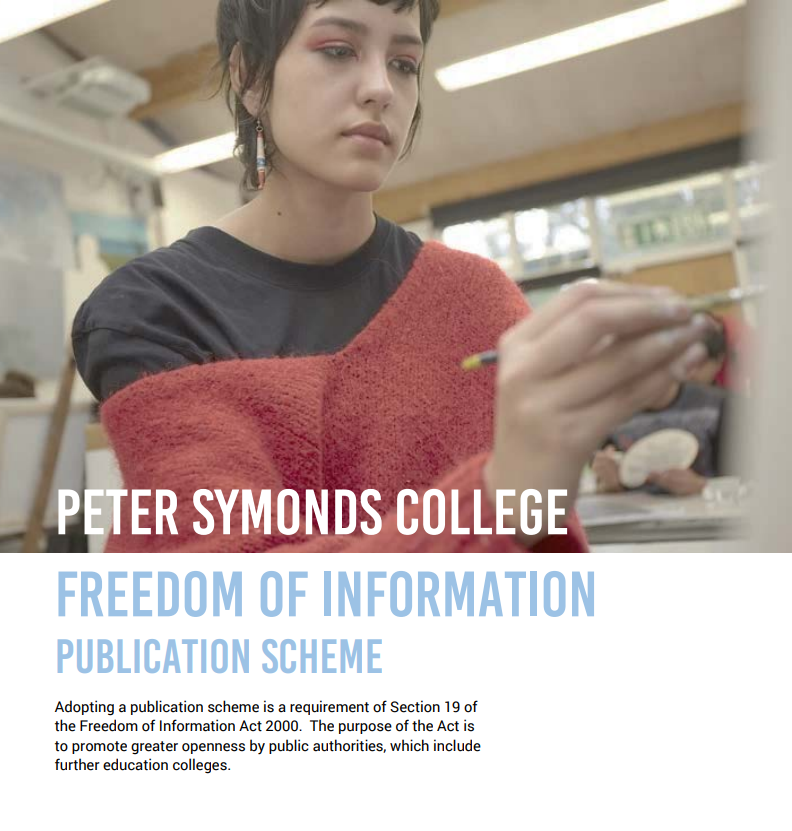 To quote the title page of the Peter Symonds College's Publication Scheme PDF:
Adopting a publication scheme is a requirement of Section 19 of the Freedom of Information Act 2000.
If 30.42% of the sector's 480 websites do not present a Publication Scheme does the Government notice? Or care? Or at least treat it as a data point on the sector's scorecard? This is a actual requirement, not a 'nice to have' and is treated as such by the Government. To reemphasise, this is the correct status attributed by hundreds of tertiary and adult education providers to providing a Publication Scheme. This is a very important detail for the next point:
Having a learning provider's public presentations be a proxy for appraising their technical sophistication certainly attracts strong counter arguments, such as it is simply unfair, or superficial, or of low/no consequence to summative outcomes. But is this case for learning providers the excel at this straightforward workstream? Also, this is the Information Age and don't we all want to facilitate active learners? So which method best facilitates active learning by students and stakeholders, if it isn't curated public presentations?
Treating all of the content on a learning provider website as learning resource actually has unforeseen benefits. A redefinition of corporate documents as a resource, along with the process of cataloguing and curating (assigning and assuring purpose) this content, provides a direct management of the public expression of legal compliance. A professionally curated opportunity for formal, informal, and incidental learning is a virtue that certainly seems to be worth the investment.
This elevation of the public presentation of corporate information to being an intrinsic part of a learning provider's actual education provision, is a benefit to everybody. This and the wider presentation and organisation of website content as curated evidence of the institution's technical sophistication, will always be short of being transformative, but despite this, it remains an effective method of addressing the sector's gratuitously 'exposed flank'.
 Prof. Izhar Oplatka in his essay on critical thinking in educational leadership for the new Education Innovations: Systems and Future Learning journal states that 'educational leaders need to cultivate critical thinking within their organisations'. My hope is that this data and reporting is of use in cultivating critical thinking by educational leaders themselves on this fundamentally important topic:
Educational leaders need to cultivate critical thinking within their organisations to assure that successful decision-making occurs and leads toward organisational advancement, improvement, innovation and creativity.
 Appendix: Appendix:The Helpful Checklist |
South Staffordshire College's AI Assistant - Full Transcript |
Jed Keenan, 13 June 2026 |