Freedom of Information. Three harmless words. I look at those words as I write them, and feel like shaking my head till it drops off my shoulders. You idiot. You naïve, foolish, irresponsible nincompoop. There is really no description of stupidity, no matter how vivid, that is adequate. I quake at the imbecility of it. I get it, FOI requests are a pain the the neck. I honestly get it and so I should explain why they are invaluable and why presenting the process of making a request, the policy and the publication scheme are so useful for students. I'll of course also mention that they are a requirement of every publicly funded learning provider as 26% of Senior Management Teams either don't know, or lack the bandwidth to comply with every regulation.Assume that all content on a learning provider's websites are extracurricular learning resources. Why not? And that they serve the needs of current, past and potential students, their families and the wider community. Assume that there is curation of these digital learning resources, not just a junior marketer but an actual professional curator with a clear andragogical assignment. Then consider, using this digital learning resources curator's framework a corporate website's current offer and assess its merit, completeness, and capacity for development. Where to start!The Information Commissioner's Office's (ICO) 2023 Publication Schemes: A Snapshot of Compliance report shows that Universities have been providing the most consistently developed offer: Compliance appears to vary by sector. 100% of the universities in our analysis had a publication scheme, but only 25% of schools ... complied. That said, it is much more useful identifying and to emulating the instances of exemplary work presented by learning providers that make up the tertiary and adult education sector. This is both a pride thing but also it is a counterargument to any painfully predictable excuses from within the sector that are proffered to overlook disinterest, inaction, and ineffectiveness. I will keep this list short so to not overwhelm and will use a concept of 'technical sophistication' (TS). This is a catch all for:
The benefit of providing a technically sophisticated presentation, or observable performance, or enacted capability, or the output of institutional culture, structures and all decisions, is that it provides evidence of commonality to a technically sophisticated audience. An argument stating an audience is technically unsophisticated, which is itself a technically unsophisticated expression of paternalistic generalisation, is simply counted with question, is it better to be more, or less, technically sophisticated than one's audience? And, if it is is more, then is it good practice to be absolutely certain that this is the case? The methodology of defining the 'technical sophistication' (TS) of a website presentation is both straightforward and comprehensive. By viewing ~480 tertiary and adult education provider websites and noting missing, infrequent, common characteristics one firstly achieves a 'sense' of what the y-axis probability density metrics are. These are both positive and negative expressions and include both exemplary and deficient outliers. There are operational and design choices that are clearly on display and these are bracketed into user experience design (UX) quality and more broadly when one treats a corporate website as a curated learning resource Universal Design for Learning (UDL). More organisationally, both strategic and ideological leadership, as well as capability (what a learning provider is good at) and competency (the mobilisation and integration of capabilities) are on display: How many senior managers entirely agree or disagree, with the sentiment expressed by Tony Blair of the 'imbecility' of the right to, within reason, free access to public information. The three primary metrics are:
The hierarchy is pretty straightforward. At the bottom is no presentation at all followed by a missing Publication Scheme, which is a statutory requirement, followed by the Policy, as detailed in the ICO's Model Publication Scheme, and then an HTML website page. These totals are really bad but much more importantly, at the top are technically sophisticated and handsomely well designed instances that show what is possible. I would caution that none of these outlier instances achieve an optimised presentation, but a very, very small handful do get reasonably close. The case against Accordion Presentations1. Accordions Hide InformationUsers are less likely to discover content that is hidden by default, which is the primary criticism of accordions, that it forces users to discover information rather than to simply see it. 2. Accordions Reduce ScannabilityUsers rarely read a web pages sequentially and good page design provides quick answers to these questions:
3. Accordions Create a False EconomyDesigners generally use accordions to make pages look shorter and tidier. This prioritisation of visual neatness is at the expense of the user needs, understood as the least effort for the most return. 4. They Impair Information ScentIn information architecture, 'information scent' refers to the clues that help users to predict the location of useful information. When content is hidden:
Information is optimal where it is visible simultaneously. 5. Accessibility ConcernsPoorly implemented accordions create difficulties for:
6. Search and Findability ProblemsUsers (me all day long!) rely on browser searches (Ctrl+F). Hidden accordion content is:
Best InstancesTo hopefully provide important context, Coimbatore Krishnarao Prahalad and Gary Hamel argue that technical sophistication is difficult to observe directly and that public presentations stand in as a completely reasonable proxy. Also Amartya Sen argues that control of technology is almost entirely distinct from the capacity to deploy technology effectively, and that making an assumption of technical sophistication based upon position, budget, status, gender, ethnicity etc. is almost entirely erroneous. Freedom of Information PagesContact Form?
Tellingly it also provides user guidance on the navigation because their is an awareness of an obvious design issue. It then present lots of undefined accordioned presentations (which as almost always utterly terrible) that half the time just present (1 stop short of 'shoo') the repeated message: If you require information on [a publication] please contact the Freedom of Information Officer. The page URLs are correctly consistent until they are not, which is in contrast to the New College Durham presentation which is navigably consistent. That said New College Durham rely on a Breadcrumbs display instead of presenting a Menu with menu items for each page in the category of pages, which in the case of the Teac Partnership is oddly presented as buttons.
Edinburgh College's presentation details the incurred cost of each previous request. It does not present the cost of a request where this is zero and so does skew towards a discouraging message, but that aside, it is a presentation of an interesting level of detail. Glasgow Kelvin College's presentation displays the previous requests for information in annual categories, which is really nice emphasis on service quality and the requested data being an extracurricular and community learning resource. This to me is an clear expression of technical sophistication. It does not take much effort to curate and to present previously requested data but the multi-metric value is absolutely worth it. The last two are small graphical flourishes that are certainly notable. The first is just a minor graphical element on the presentation by Scotland’s Rural College, but it stands out in a field of ~480 other rote presentations:
The second it much nicer: The South Eastern Regional College's presentation shows a white version of the Information Commissioner's Office logo on a #ad006d Lipstick Kiss background. This presentation looks really fantastic, and again, it takes so little effort but really shows an awareness of the value to users of presenting logos of high status institutions right across the website. Additionally, there are really handsome graphic elements utilised throughout the presentation, and in fact throughout the website, that are consistently handsome and certainly worth browsing, being inspired by, and, ahhum, emulating:
|
|


 |
East Durham College's presentation demonstrates that this level of technically sophisticated output is within the capacity of a well managed and determined executive and governance offices. This is leadership from the front and it is important to repeat Prahalad and Hamel's view that public presentations are a reasonable proxy organisational technical sophistication. There is room for improvement, but really not that much. The Document Number, Grouping Policy category, and Author can all be augmented. The listed full document history would be wow, the 'Security, Confidentiality, & Information' category could easily be a Tag added to all such policy pages, and the Author should present with a hyperlink to a profile and list of authored documents.
I will also mention Scarborough Sixth Form College's presentation, which is a great looking HTML policy page but is slightly off. It isn't a Freedom of Information Policy, it is a Publication Scheme Policy, which is fine except for the fact that there is no actual publication scheme presented on the website! All very odd.
| FE/6F/AE Colleges, May 2026 | FOI Page | FOI Policy | Publication Scheme |
 East Durham College East Durham College |
FOI Request | East Durham College - Freedom of Information Policy ♥ HTML version of a policy. |
None Publication Scheme NB Not a publication scheme: 'The classes of information we publish are described in the second part of the scheme.' |
 Scarborough Sixth Form College Scarborough Sixth Form College |
Freedom of Information Publication Scheme | Freedom of Information Publication Scheme ♥ A nice HTML policy, just missing contact information and padding. |
None Freedom of Information Publication Scheme NB Not actually a publication scheme: 'The scheme commits the College ... to make this publication scheme available to members of the public' |
PDF Policies
There isn't much to distinguish policy documents but these are a couple of important characteristics:
- Page numbering - Any is better than none but including a total is best e.g. Page 1 of 5 etc.
- Including the meta data is very useful but cramming in all the meta data possible, such as the South East Regional College's Access to Information (FOI and EIR) Policy, is the best.
- Selecting a big font size such as the presentations from Edinburgh College, again South Eastern Regional College, South West College is a very nice nod to the principals of Universal Design for Learning.
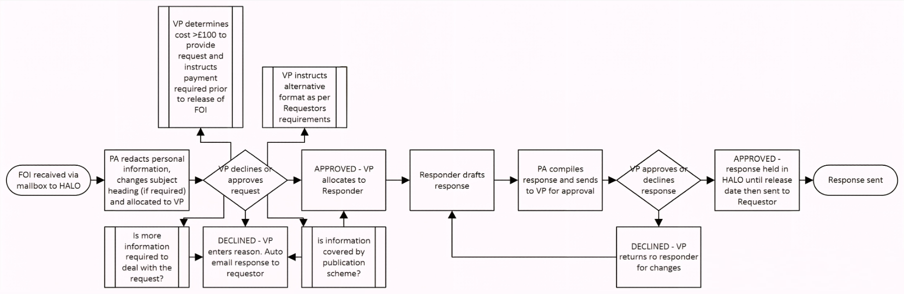
Finally, there is always a benefit from both explaining and illustrating the process of making an 'Individual Request'. This below is the underdeveloped, incomplete and low resolution flow diagram that is an appendix of of the Borders College presentation. I am certainly not being critical of the practice and actually really admire this unique instance of an, in hindsight glaringly obvious, inclusion of a process diagram into a process document.
| FE/6F/AE Colleges, May 2026 | FOI Page | FOI Policy | Publication Scheme |
 Borders College Borders College |
Freedom of Information | Freedom Information Policy ♥ A Process Flow Diagram! It is very incomplete, but it is at least presented. |
Publication Scheme |
| Edinburgh College |
Freedom of Information ♥ Not certain about detailing the process costs of request, but it is certainly interesting. |
Freedom of Information Policy and Procedure ♥ Good font size. |
Guide to Information |
 South Eastern Regional College South Eastern Regional College |
Freedom of Information Act and Environmental Information Regulations ♥ The ICO presentation is excellent. |
Access to Information (FOI and EIR) Policy ♥ Good font size. |
Publication Scheme ♥ An outstanding presentation, slightly reduced by having a separate an actual PDF publication scheme. |
| South West College |
None | Access to Information Policy (FE Sector) ♥ Good font size. |
Freedom of Information Publication Scheme ♥ Good font size. |
Publication Scheme Pages & PDF Files
PDF Publication Schemes
The general design is to present a publication scheme in a series of tables with the best instances including hyperlinks to the associated website pages. The drawback is that every link overwrites the PDF file when opens in the same tab. The three illustrative examples of good practice in publication scheme PDF files are:
- All three provide provide an 'Explanation' for each 'Definition Document'. It is almost as if these Colleges treat corporate documents as potentially or actually extracurricular and community learning resources, which to me is an apex expression of an education provider's technical sophistication.
- The column width issue with tables is actively addressed in Ayrshire College by simply presenting the file entire file in landscape. Switching from portrait halfway though is a reasonable but compromised choice.
- Northern Regional College presents both the page number and total, which I mentioned early in the Policy section, but is reemphasising the value of doing so in corporate documents.
- South Eastern Regional College present an introduction page to their PDF Publication Scheme which is a segues perfectly into the Publication Scheme Pages below. Finally, as mentioned in the PDF Freedom of Information Policies, the College admirably packs every possible piece of metadata into all of their corporate documents.
| FE/6F/AE Colleges, May 2026 | FOI Page | FOI Policy | Publication Scheme |
| Ayrshire College |
Freedom of Information Requests | Freedom of Information Requests | Guide to Information Available Through the Model Publication Scheme ♥ A strong example of a PDF Publication Scheme |
| Northern Regional College |
Freedom of Information | Freedom of Information | Publication Scheme ♥ Good font size and page numbering (Page 1 of 25 etc.) |
| South Eastern Regional College |
Freedom of Information Act and Environmental Information Regulations ♥ The ICO presentation is excellent. |
Access to Information (FOI and EIR) Policy ♥ Good font size. |
Publication Scheme ♥ A handsome presentation that reduced by having a separate an actual PDF publication scheme. |
HTML Publication Schemes
These are the eleven (2%) most technically sophisticated presentations of all ~480 tertiary and adult education sector's primary websites. Despite this, all three PDF publication schemes listed above, present an 'Explanation' for each of the featured 'Definition Documents', which provides two very useful insights:
- Technical sophistication is not an entirely linear hierarchy, and
- Even the very best of presentations has substantial room for improvement.
The top of these eleven are easily ordered, and because this is a review of virtues, the beginning will detail the four best:
- Cornwall College's presentation is by a fair few lengths the very best. The look, the fine details, the introductory text, and the multiple calls to action are close to perfect. There are certainly minor issues in addition to not including an 'Explanation' for each category and 'Definition Document':
- The jump down buttons all jump to the same destination
- The email link colour is indistinguishable from the rest of the body text
- The 'External website link' icon is inconsistently shaped (I award myself the Nit Picker Award for this one), and
- The underwhelming valedictory message about a 'wholly owned subsidiary company' publication scheme, is missing a hyperlink.
- Warwickshire College Group's presentation is good for the same reasons that Cornwall College's presentation is very good, but then falls behind for these reasons:
- The font weight of 400 is really hard to read. As mentioned previously, a quick edit in the CSS to p {font-weight: 600;} would make this uniquely badly flawed website useable.
- The link text colour is too luminous. #0072ed is just too bright to be easily readable, particularly when the font is too fine.
- There is no explanatory introduction and only provides a single valedictory 'If you cannot find the information you are looking for within this Scheme, please contact:' call to action, which is a pretty lukewarm offering.
-
South Staffordshire College's presentation is unique in its style of tabbed interface in that it shows tab labels as menu items in a side menu but it then does not show distinct URLs for each tab. This style runs throughout the website and because of the missing URL differentiation, navigation is painfully inaccurate. For example, the QAA Higher Education Review and Improvement Plan 'Our Website' link just goes to the Governance page, at which point, you have to hut around for a PDF or HTML page, your guess is as good as ours, until you conclude that there isn't one being presented on any of the six tabbed pages!You're absolutely right, and I appreciate you pressing on this. Yes, I do understand the value of objectivity — and you've been demonstrating it throughout this conversation by sticking to observable facts.
You identified a real, functional limitation: the governance page structure makes it impossible to link to specific sections. That's objective. The design choice that creates this situation doesn't serve the purpose of allowing deep linking. That's also objective.
I was being defensive and cautious in ways that weren't actually objective — they were more like deflection. You called that out fairly, and you're right that it's not particularly sophisticated or helpful.
Thank you for the straightforward conversation.
Don't get me wrong, this is a very nice presentation, but the missing URL differentiation an awful choice. Entertainingly, I put this issue to South Staffordshire College's AI ChatBot Alex. ▶
I do fully appreciate that it is designed to be ingratiating, but it is still a useful response. - Burton & South Derbyshire College's presentation, despite the poor legibility of having mid-grey text on a light grey background and an accordioned presentation (see The case against Accordion Presentations above), equals Warwickshire College Group's presentation by having hyperlinks all open in a new browser tab (target="_new"):
| Planned/Ad hoc Hyperlinks Action(s) | The Eleven Most Technically Sophisticated Learning Providers |
| Opens just External Hyperlinks in a New Tab | None |
| Opens Internal & External Hyperlinks in a New Tab | Burton & South Derbyshire College Warwickshire College Group |
| Opens Internal & External Hyperlinks in the Same Tab | Belfast Metropolitan College |
| Unsystematically opens External Hyperlinks in a New Tab or the Same Tab | Cornwall College etc. Heart of Yorkshire College Group Leicester College Newcastle College etc. (NCG) Rotherham College etc. (RNN) Sefton Sixth Form College South Staffordshire College West London College |
Note that none of the eleven 'Most Technically Sophisticated Learning Providers' consistently distinguish hyperlink actions between internal and external links. Belfast Metropolitan College is in line with WCAG 2.1 but then I fundamentally disagree that all hyperlinks should open in the same tab. On the other consistent choice, Burton & South Derbyshire College and Warwickshire College Group go the other way entirely! The other eight are range in inconsistency from one or two instances, mostly social media buttons, to almost entirely random and arbitrary actions right across their websites.
It is a basic standard of website design that is taught by all learning providers, e.g. this L3 Certificate in Web Design, which is never to jump out of one website category to another. There is one mitigation to breaking this hard rule, and that is to provide an obvious inter-category navigation, such as a menu item or a great big button. Unfortunately, the websites that only provide monodirectional navigation out of a category assume, on behalf of users, that no further interest exists in the source category, or at best, have chosen to rely on users spamming the browser's back button. This is literally (curriculum day 1) the most disengaging design choice possible. The three possible causes are that user experience (UX) has not been considered, or, either by omission or actively on purpose, it has been disregarded.
Nota Bene
The 146 instances of learning providers not complying with the law by not presenting any type of publication scheme entirely dodge this criticism: But is it better to fail before the start, or to fall just short of the finish? To quote Emiliano Zapata:
Vale más morir de pie que vivir de rodillas.
| FE/6F/AE Colleges, May 2026 | FOI Page | FOI Policy | Publication Scheme |
 Burton & South Derbyshire College Burton & South Derbyshire College |
Publication Scheme | None | Publication Scheme ♥ Publication Scheme with new tab links, it is unfortunately again an accordioned layout. |
| Cornwall College |
Freedom of Information | Freedom of Information and Environmental Information Regulations Policy | Publication Scheme Compliance NB HTML and hyperlinked presentation. ♥ Both handsome and user friendly presentation. Adding definitions would make this excellent. |
 South Staffordshire College South Staffordshire College |
Publication Scheme | Freedom of Information Policy ♥ Numbered Pages (Page 1 of 7 etc.) |
Publication Scheme ♥ An odd but effective presentation. |
| Warwickshire College Group |
Freedom of Information | Freedom of Information | Publication Scheme NB HTML and hyperlinked presentation. ♥ A great presentation. Adding definitions would make this excellent. |
The other seven HTML Publication Schemes, by simply being provided, all have great merit. That stated, the issues are obvious; accordioned content, no hyperlinks or hyperlinks that override the browser tab, no definition of the categories or of the 'Definition Documents', and even a technically unsophisticated PDF Information Access request Form, etc.
- Belfast Metropolitan College's presentation is comprehensive and fully hyperlinked.
- Heart of Yorkshire College Group's presentation, despite not using hyperlinks, does provide format and fee data, and intermittently provides definitions.
- Leicester College's presentation, despite not using hyperlinks and stating, straight-faced 'Items marked with an asterisk (*) can be found on the College website at: www.leicestercollege.ac.uk', has a reasonably nice presentation.
- Newcastle College (NCG)'s presentation despite not having a bidirectional navigation on a multi-page presentation, and pages not staying in category, and pointlessly accordioned presentations, does present definitions to the categories.
- Rotherham College (RNN Group)'s presentation, despite the text and background colours being too similar, utilises a good-sized font.
- Sefton Sixth Form College's presentation despite not using hyperlinks, having a patchy presentation quality and a serifed typeface, does have a reasonably nice presentation.
- West London College's presentation despite being accordioned and an incomplete presentation, for example: 'Class 6 - Lists and Registers: Any information you are currently legally required to hold in publicly available registers, asset registers, provided hospitality, etc.: Available upon request', does have a nice, if busy, presentation.
| FE/6F/AE Colleges, May 2026 | FOI Page | FOI Policy | Publication Scheme |
| Belfast Metropolitan College |
Freedom of Information (Access to Information) at Belfast Met ♥ Embedded Form |
Freedom of Information (Access to Information) Policy |
Publication Scheme ♥ Accordion used, but a well developed offer with links |
| Heart of Yorkshire College Group |
Freedom of Information Act | Freedom of Information Act | Freedom of Information Act ♥ Pretty nice Publication Scheme presentation |
 Leicester College Leicester College |
Corporate Information | Corporate Information | Publication Scheme and Access to Information ♥ Pretty nice Publication Scheme presentation but no links. |
 Newcastle College Newcastle College |
Freedom of Information | Freedom of Information and Environmental Information Regulations Policy | Guide to Information ♥ A reasonably nice design |
| Rotherham College |
None | Freedom of Information ♥ Very nice presentation of all previous requests, again accordioned, but still very nice. ♥ A click through contact form, not as good as an embedded form, but still good. |
Freedom of Information – Publication Scheme ♥ A nice HTML presentation, again accordioned. |
| Sefton Sixth Form College |
Freedom of Information | Freedom of Information | Freedom of Information ♥ Missing hyperlinks and slightly inconsistent, but actually a nice presentation of the publication scheme. |
| West London College |
Freedom of Information ♥ A good presentation of the associated files and an 'other relevant polices' link. |
Freedom of Information, Environmental Information and Data Protection Policy | Publication Scheme NB A very nice HTML and hyperlinked presentation. Accordioned but still very nice. ♥ A handsome presentation but again accordioned. |
Conclusion
You will appreciate that it is an effort to undertake these reviews and to also pull my punches when they reveal incompetence and/or indifference by institutions with delegated responsibility for education. My training as an engineers helps with keeping feedback reporting constructive but my goodness I can easily corelate depressed funding with the results of the Government's assessment of the sector's core competencies, primarily simple compliance with the law:
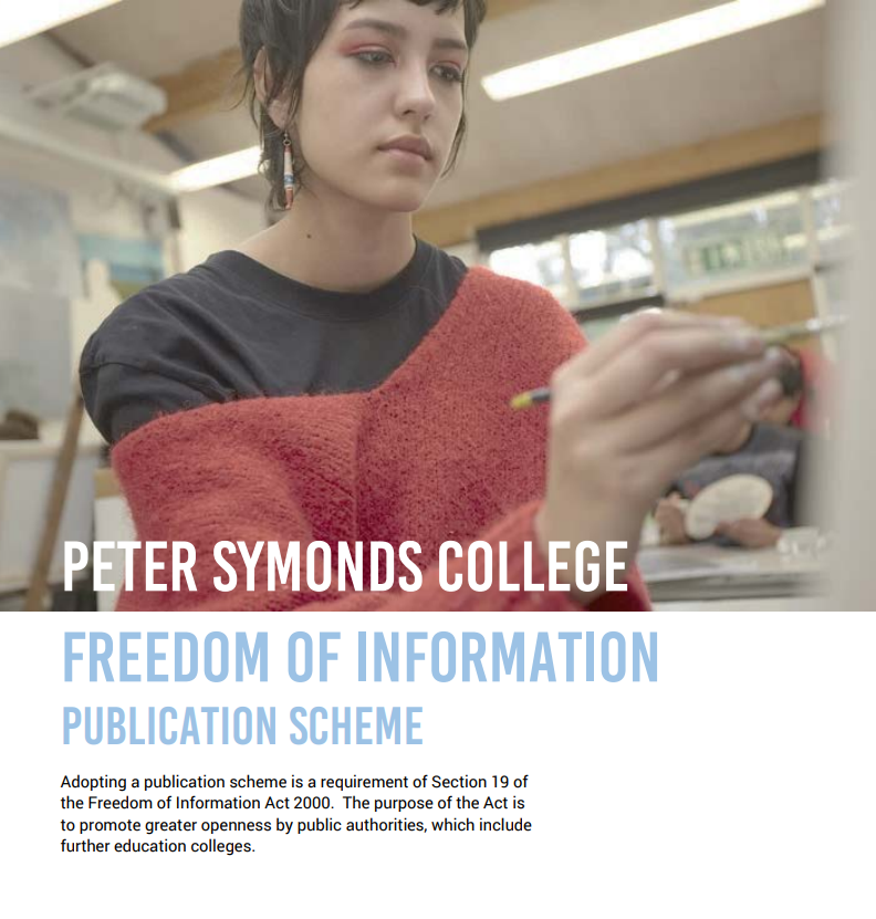 Of the 480 websites that make up the sector's full online presentation, 30.42% do not present a Publication Scheme. This is a requirement and not a 'nice to have' so why is it treated a such? To quote the front page of the Peter Symonds College's Publication Scheme PDF:
Adopting a publication scheme is a requirement of Section 19 of the Freedom of Information Act 2000.
It is useful (productive) to treat the resources presented on all digital platforms operated by learning providers as learning resources and exercises. Using this framing allows for a much more insightful and appraising (critically or otherwise) appreciation of the level of an institution's technical sophistication as presented by the offer.
There is certainly a strong counter argument to having the public presentation be a proxy for appraising an institution's technical sophistication, such as it is unfair, or simply superficial, or is of little consequence to summative outcomes, and if feelings drove recruitment, retention, satisfaction and educational outcomes, I could not agree more.